


When Kyla Bidgood and her team at Bidgood + Co start a design project, they usually get to see the space before they envision its look and layout, but for xMatters’ Victoria location at 1515 Douglas, the design strategy had to be approached from a set of floor plans.
Luckily the designers had other projects in the new development — including Workday on the top floor and Sherwood Cafe & Bar on the first — so they were familiar with the potential within the building.
“The architecture of the building very much dictated the layout,” says Bidgood, who worked on the project with Mary McNeill-Knowles.
A walk-through of xMatters’ existing space on Fort Street also gave them an idea of what the company wanted moving forward.
“What was really interesting about this project was, rather than just trying to improve on what their old space was lacking, they were also open to looking at working in a new way,” Bidgood says.
“The first impression of that existing space was that it was very dark, which was on purpose, as they had all the lights turned off — and the engineers spent a lot of their time with their headphones on, zoned in on their work. The layout felt a bit congested with a series of private offices and one big open workspace. And their kitchen was in the middle of the corridor, so it didn’t really have a designated staff area. That was one of the mandates with the new space — having a better social area.”
Bidgood describes the approach to the design as very collaborative with the client.
“We’re not here to tell them how to work,” she says.
Ditching the Open Office
The client was led through a series of questions to determine the ideal setup. These questions included looking at how the staff worked in the old space, which groups needed to sit together, what were the ideal adjacencies, which people had to collaborate and who needed to focus.
“Maybe they should be furthest away from the lunch area, for example,” Bidgood says. “It was through these conversations that we came up with this concept of team rooms, rather than one big open space.”
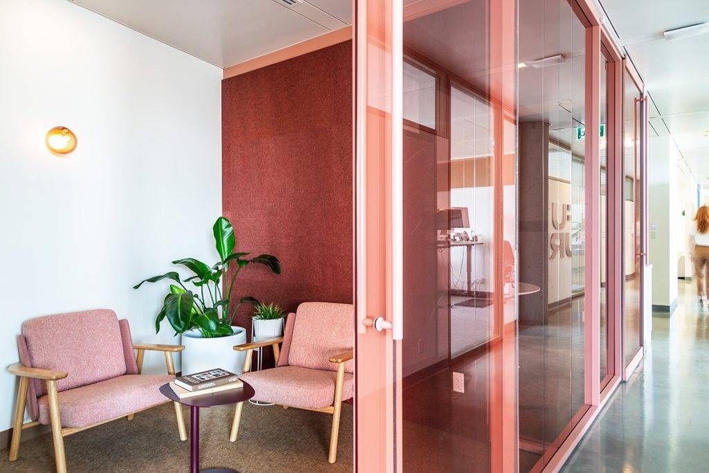
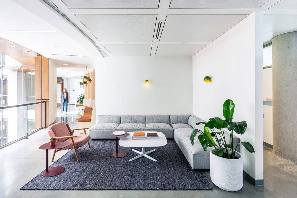
The space was broken into five team rooms, with six to eight workstations in each. These rooms run along the exterior windows — so each team can control their own lighting — and have clerestory windows so some natural light passes into the centre area, which faces the rotunda. The central zone houses the social areas, including the kitchen and lounge.
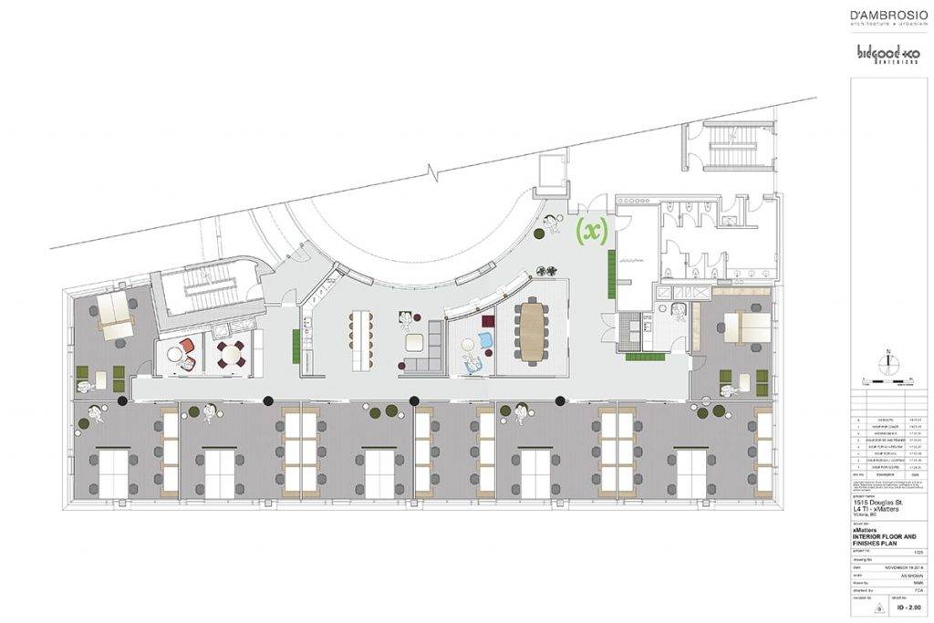
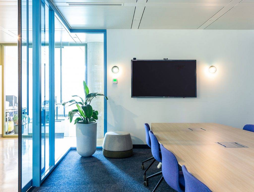
“And a nice banquette where people can break out and sit with their laptop and work, or take a break if they want to,” Bidgood says. “We also created additional meeting spaces, including one large meeting space and some smaller breakout areas.”
Colour Connections
To ensure the look and feel was heading in the right esthetic direction before it got too far along in the process, the designers put together a “splash page” to gauge the client’s reaction.
“It highlights colours and images of other spaces to get their feedback,” Bidgood says. “That is their time to say, ‘We hate pink,’ or ‘It has to have this in it.’ It really sets the groundwork before we spend too much time developing something that they’re not going to be happy with.”
The rich use of colour throughout the space was inspired by the company’s branding colour, chartreuse green, which was prevalent in the previous space.
“We used the branding colour as a direction, as opposed to overtly splashing it over every surface, which has more of a startup feel,” McNeill-Knowles says. “We did that by balancing it out with other colours, such as the darker green and peach. It makes the space feel more polished and reflects their current status.”
This article is from the October/November 2019 issue of Douglas.


